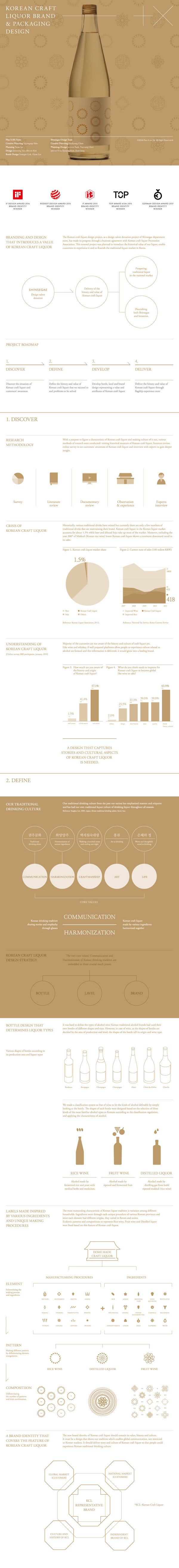


Korean Craft Liquor Brand & Bottle, Packaging Design
Shinsegae Traditional Liquor Design Renewal is a design talent donation project of Shinsegae department store. Korean traditional liquor contains various tastes and smell. However, its identity was not as much recognized as wine or Japanese sake.
The overall design was renewed to maintain the tradition and features of liquor and to build up a single representative identity. Bottles were designed to reflect the features of rice wine, fruit liquor and distilled liquor. The main graphic motifs were fixed based on the various materials, and these motifs were modulated as elements of communication through consistent application on logos, labels, packages and spaces.
신세계 전통주 디자인 리뉴얼 프로젝트는 신세계 백화점의 디자인 재능 기부 프로젝트입니다. 한국의 전통주는 그 맛과 향이 다양하다는 특징이 있지만, 동시에 와인이나 사케 대비 하나의 아이덴티티로서의 대표성이 약하다는 단점이 있었습니다. 우리는 각 술의 전통과 특징을 계승하는 동시에 하나의 아이덴티티 룩을 형성할 수 있도록 전반적인 디자인을 리뉴얼했습니다. 병 디자인은 약주, 과실주, 증류주의 특징을 표현하였으며, 그래픽 디자인의 경우 다양한 원재료의 특징을 모티브로 디자인하고, 이를 모듈화하여 로고, 라벨, 패키지, 공간 등 커뮤니케이션 요소에 일관되게 적용하였습니다.
Background
Shinsegae Traditional Liquor Design Renewal is a design talent donation project of Shinsegae department store to flourish the traditional liquor market in Korea. Korean traditional liquor contains different ingredients of various tastes and smells from various regions. However, its identity was not as much recognized as wine or Japanese sake.
The overall design was renewed to maintain the tradition and features of liquor and to build up a single representative identity.
신세계 전통주 디자인 리뉴얼 프로젝트는 한국의 전통주 시장 활성화를 위한 신세계 백화점의 디자인 재능 기부 프로젝트입니다. 한국의 전통주는 다양한 지역에서 각기 다른 원료들의 조합으로 만들어지기 때문에 그 맛과 향이 다양하다는 특징이 있지만, 동시에 와인이나 사케 대비 하나의 아이덴티티로서의 대표성이 약하다는 단점이 있었습니다. 우리는 한국 전통주의 전통과 특징을 계승하는 동시에 하나의 아이덴티티 룩을 형성할 수 있도록 전반적인 디자인을 리뉴얼 했습니다.
Strategy
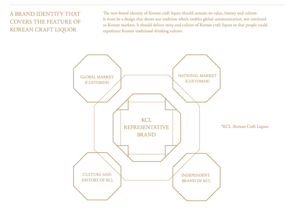
Korean traditional liquor can be classified into three main categories: fruit-based liquor, rice wine and distilled liquor. A design that unifies the three categories together as a single look and at the same time distinguishes each of their endemic features was desperate.
The design concept based on the history of Korean traditional liquor was mainly focused on taste, smell and the impression each color delivers.
For the project, three main design keywords were deducted. Consistency that fully represents Korean traditional liquor, differentiation that distinguishes fruit-based liquor, rice wine and distilled liquor based on its manufacturing procedures and flexibility to reflect distinctive features the three, made of different ingredients from various regions through unique processes, has.
For the project, three main design keywords were deducted. Consistency that fully represents Korean traditional liquor, differentiation that distinguishes fruit-based liquor, rice wine and distilled liquor based on its manufacturing procedures and flexibility to reflect distinctive features the three, made of different ingredients from various regions through unique processes, has.
한국 전통주는 과실주, 약주, 증류주로 크게 세 가지 카테고리로 나눌 수 있습니다. 이 세 가지 카테고리를 하나로 묶어주면서 카테고리마다의 특징을 담고 있고, 동시에 각각의 전통주 마다 차별성을 줄 수 있는 디자인이 필요했습니다. 한국 전통주의 역사적인 상황을 내포하여 세 가지 술에 대한 맛, 향, 색깔에서 전해지는 느낌에 집중하는 디자인 컨셉을 잡았습니다.
프로젝트를 위해서 우리는 세 가지 디자인 키워드를 도출했습니다. 첫째, 한국 전통주라는 큰 개념과 특징을 담는 일관성(consistency)입니다. 둘째, 과실주, 증류주, 약주 제조 방식에 따라 각각을 구분시켜줄 수 있는 표현 차별성 (Differentiation)이 필요합니다. 마지막으로, 한국전통주의 특징은 전통주 마다 다양한 재료를 사용하고 저마다 독특한 공정과정을 거쳐 술을 만들기 때문에 그 향과 맛, 빛깔이 모두 다르기에 이러한 특징을 잘 반영할 수 있도록 확장성 (Flexibility) 있는 디자인이 필요했습니다.
프로젝트를 위해서 우리는 세 가지 디자인 키워드를 도출했습니다. 첫째, 한국 전통주라는 큰 개념과 특징을 담는 일관성(consistency)입니다. 둘째, 과실주, 증류주, 약주 제조 방식에 따라 각각을 구분시켜줄 수 있는 표현 차별성 (Differentiation)이 필요합니다. 마지막으로, 한국전통주의 특징은 전통주 마다 다양한 재료를 사용하고 저마다 독특한 공정과정을 거쳐 술을 만들기 때문에 그 향과 맛, 빛깔이 모두 다르기에 이러한 특징을 잘 반영할 수 있도록 확장성 (Flexibility) 있는 디자인이 필요했습니다.
Design
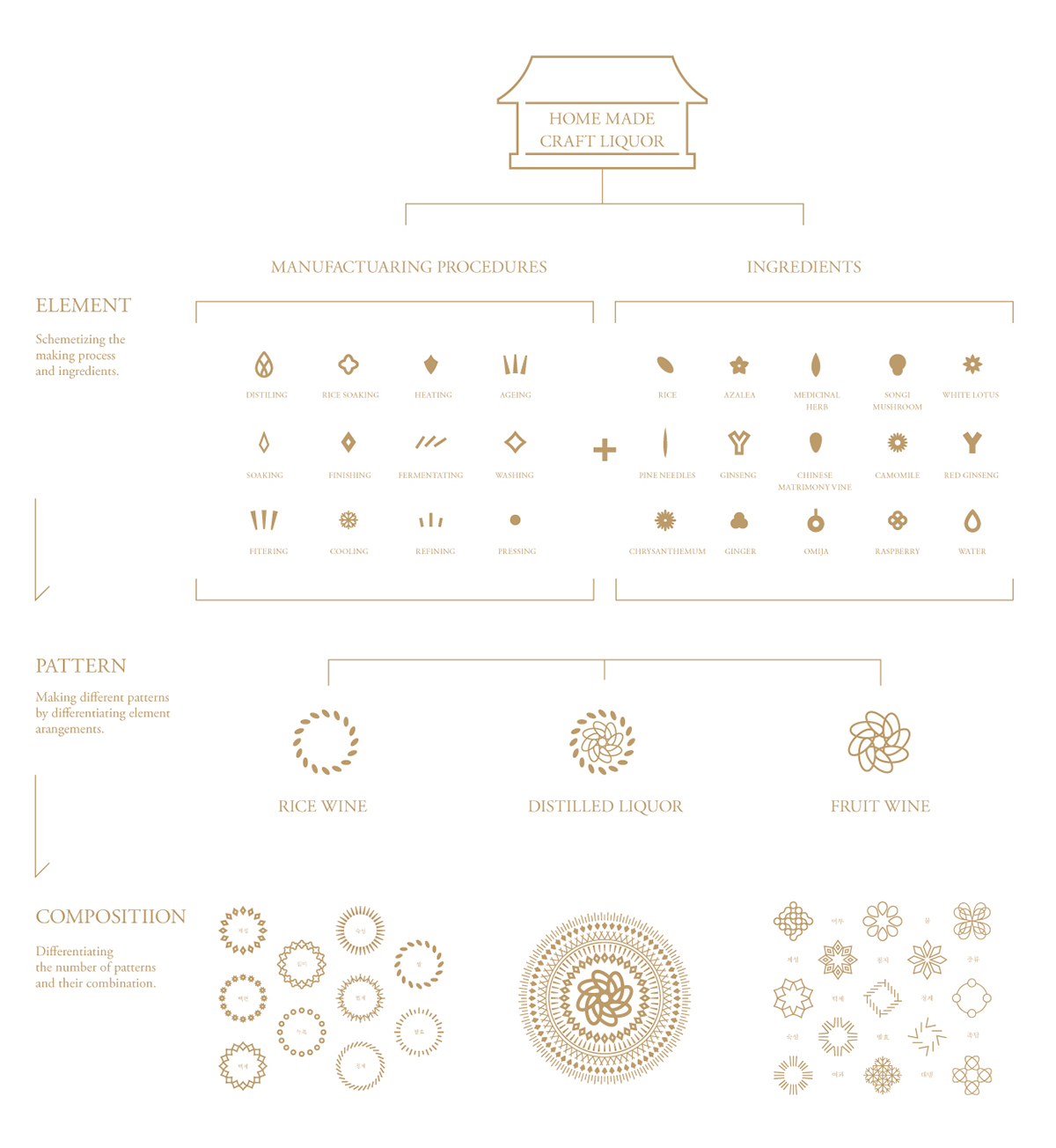
Three sets of icons were made for each category to represent the used ingredients and unique manufacturing process that they went through. These icons were arranged into peculiar patterns for each category. The three sets were differentiated by its combination but unified by identically using line drawing method. The will to preserve our tradition was conceptualized through the shape of the bottles. Based on this background, the bottles were formed of joined straight lines to visualize our progressive spirit.
각 전통주의 특징을 표현하기 위해 우리는 각각의 전통주를 만드는데 필요한 독특한 공정 과정과 재료를 상징하는 카테고리 별 세 개의 아이콘 세트를 만들었습니다. 그리고 이를 패턴화하여 카테고리마다 독특한 문양의 배열을 도출했습니다. 세 가지 카테고리 아이콘들은 조합 형태를 달리하여 차별화를 두었지만, 모두 라인드로잉을 활용하여 통일감을 갖도록 디자인 했습니다. 카테고리 안에서는 사용된 아이콘들의 종류와 배치를 다르게 하여 개별 전통주 마다 고유의 패턴이 생성되도록 차별화를 두었습니다.
병의 경우, 우리의 전통주를 이어가겠다는 의지를 컨셉화 하였습니다. 이러한 백그라운드에서 병 모양을 곧은 직선과 직선으로 이어지게 디자인하여 진취적 기상을 나타냈습니다.
병의 경우, 우리의 전통주를 이어가겠다는 의지를 컨셉화 하였습니다. 이러한 백그라운드에서 병 모양을 곧은 직선과 직선으로 이어지게 디자인하여 진취적 기상을 나타냈습니다.
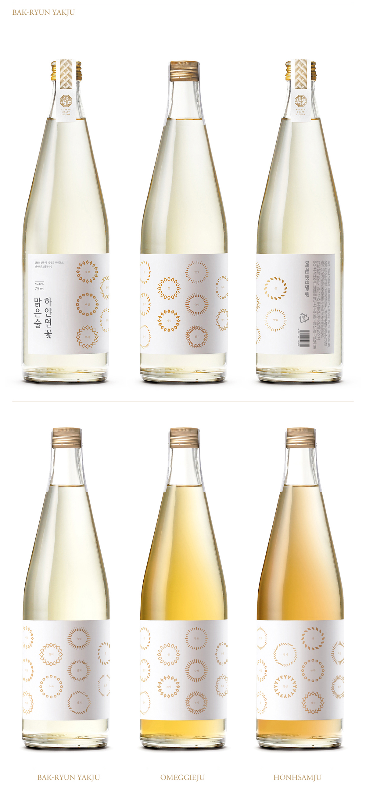
Rice wine
Firstly, rice wine is the representative of Korean traditional liquor. Its main ingredient, rice adds its unique refreshing and mild taste to it. Curved and circular patterns were used to give an elegant impression. The part where straight lines meet to form the bottle was smoothly curved to represent conservation of tradition. Modern emotional aspect of traditional liquor was reflected through minimally designed aluminum cap.
약주
첫째 약주는 우리 전통주의 대표적인 상품으로 쌀로 만들어 맑고 부드러우며 특유의 향미가 있는 술입니다. 이러한 약주에는 부드럽고 우아한 원형의 문양을 패턴화하여 사용하였습니다.
병의 경우, 직선과 직선이 만나는 부분에 유려한 곡선을 넣어 전통이 이어짐을 나타내려고 하였고 고급스러운 알루미늄 캡을 달아 전통주의 현대적인 감성을 표현했습니다.
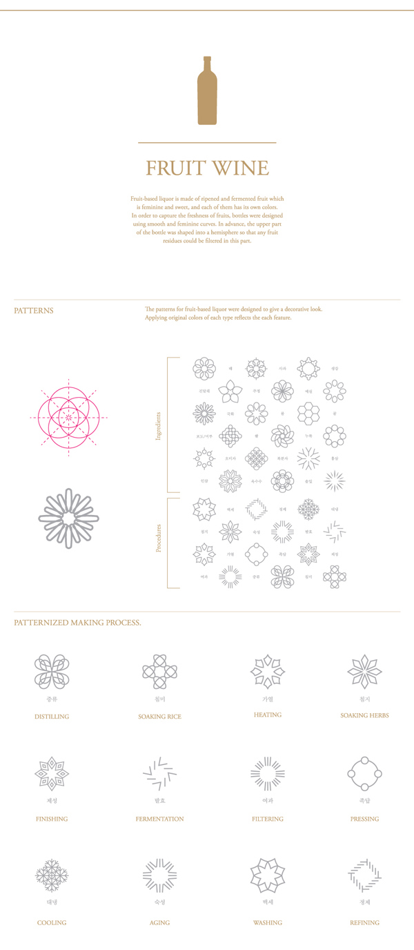
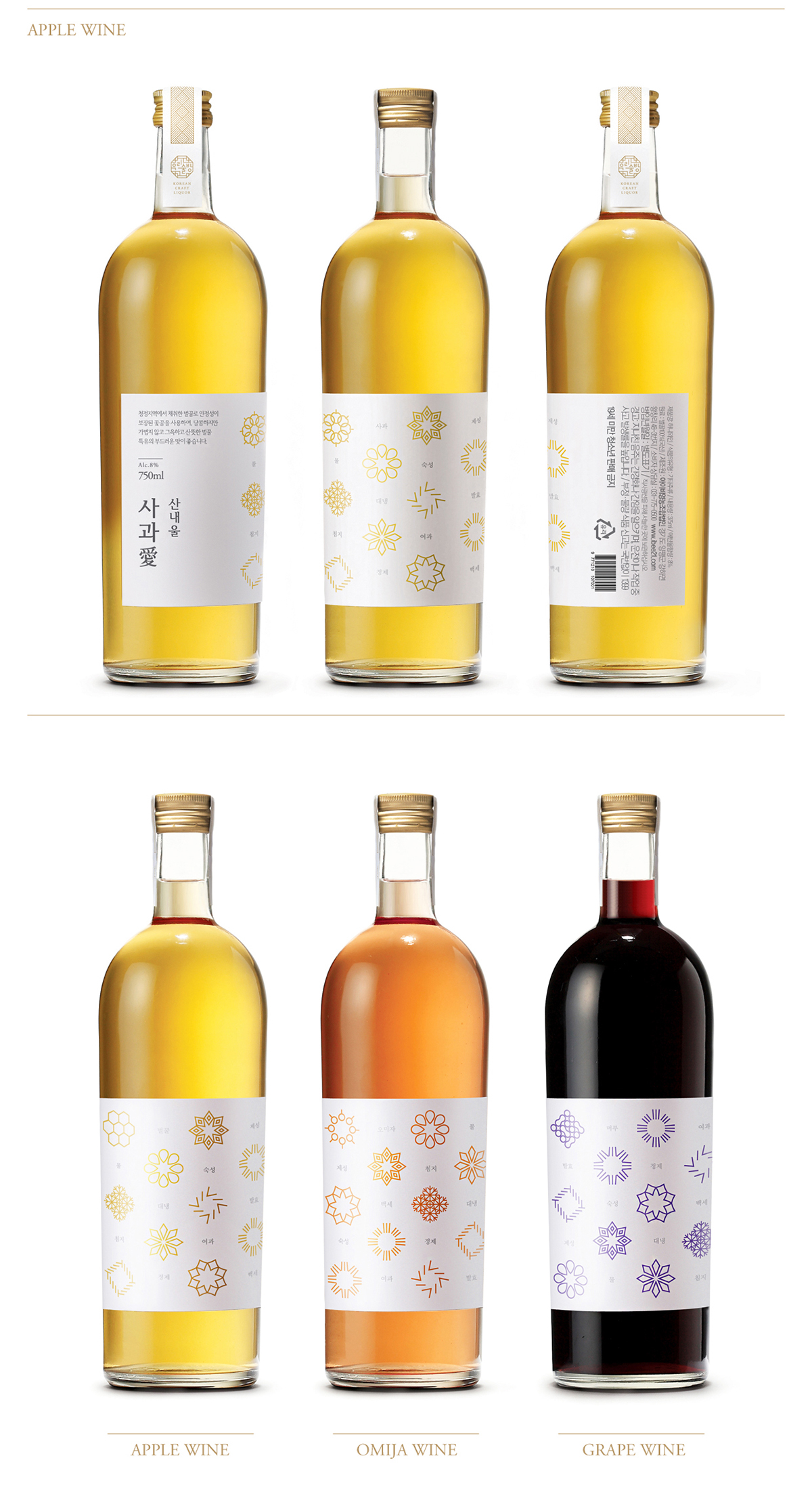
Fruit-based liquor
Fruit-based liquor is feminine and sweet, and each of them has its own colors. It was designed to deliver a decorative look and identically display the color of the icons to match the color of each flavor. The smooth curve from the bottle neck to the body was designed to visualize freshness of fruits.
과실주
과실주는 여성적이고 달콤하며 저마다 다채로운 색을 가지고 있습니다. 따라서 장식적인 느낌으로 디자인 하였고, 과실주 각각의 색을 이용하여 아이콘의 색을 도출하였습니다. 싱그러운 과일의 분위기를 담기 위해 병 상단에 반구를 위치시켜 과실주의 상큼함을 표현하였습니다.
Distilled liquor
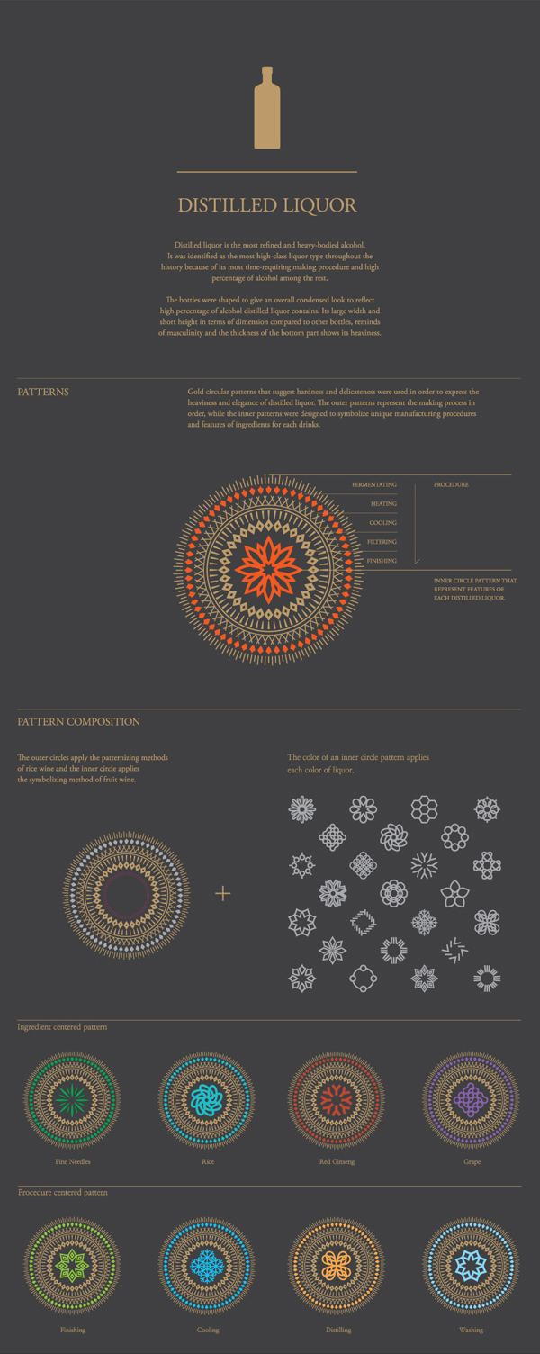
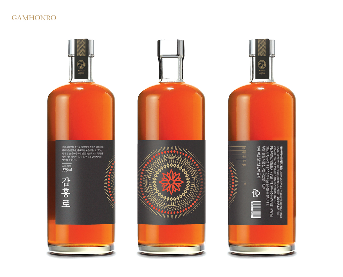
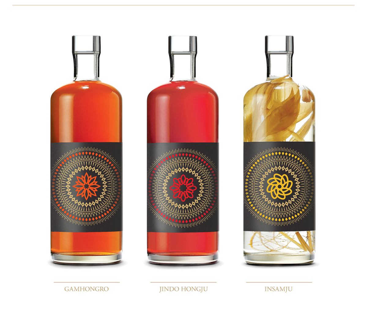
Last, the most refined alcohol beverage, distilled liquor is most heavy-bodied. It was identified as the most high-class liquor type throughout the history as the manufacturing process required most time among the rest. In order to deliver such features, symbolic circular patterns in gold on black background were used to add luxury. The outer pattern was illustrated to represent the producing process. The icon placed on the center of the pattern was formed to symbolize ingredients and distinct distillation procedures that different alcoholic drinks went through to produce various flavors.
The bottles were shaped to give an overall condensed impression to reflect high percentage of alcohol distilled liquor contains. Its large width and short height in terms of dimension compared to other bottles, reminds of masculinity and the thickness of the bottom part shows its heaviness.
증류주
셋째 증류주는 가장 정제된 술로 도수가 높은 술입니다. 증류주는 제조하는데 가장 많은 시간이 걸리고 도수가 높아 예로부터 고급 술로 취급되어 왔습니다. 이러한 증류주의 특징에 고급스러움을 주기 위해 금색의 뚜렷한 원형의 심볼 아이콘을 검은 배경 위에 배치하여 디자인 하였습니다. 바깥쪽 패턴은 증류주 제조 과정을 도식화하고, 중심 패턴에는 각 증류주마다의 독특한 공정 과정이나 원료의 특징을 상징하는 아이콘을 배치하였습니다. 증류주의 병 디자인은 도수가 높다는 특징을 단단하게 응축되어 있는 것처럼 표현하고자 하였습니다. 증류주의 병은 다른 병에 비해 넓고 키는 낮게 하여 남성적인 느낌을 담았으며, 병 밑 부분을 두껍게 하여 무게감을 표현했습니다.
Brand Mark
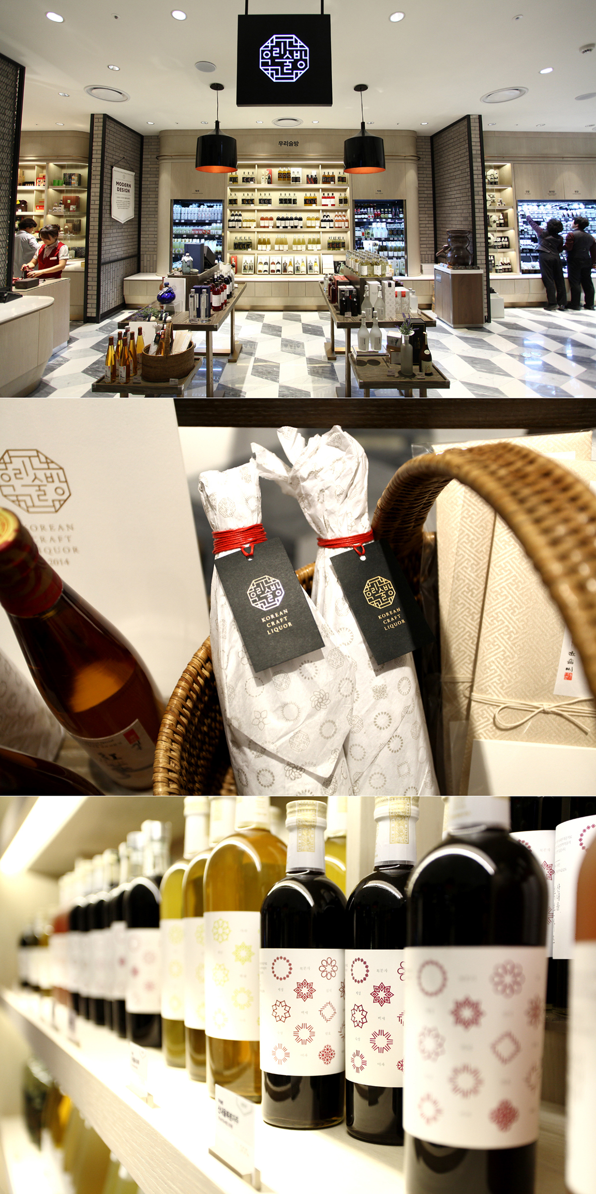
‘Woorisulbang’ is a space for selling traditional liquor of Korea in Shinsegae Department Store, Korea. Brand mark of Woorisulbang holds liquors of three categories: fruit-based liquor, distilled liquor and rice wine. It was inspired by the patterns on Korean traditional doors. The doors symbolize communication between indoors and outdoors. To Koreans, liquor represented food, culture and the means of communication more than alcoholic beverage as itself. The feature of authentic communication through shared glasses throughout Korean tradition was blended into the brand mark.
우리술방 브랜드 마크
우리술방은 한국의 전통주를 판매하는 신세계 백화점의 공간 브랜드입니다. 우리술방의 브랜드 마크는 세 가지 카테고리의 술: 증류주, 약주, 과실주를 하나의 브랜드로 묶어주는 역할을 합니다. 한국 전통주를 대표하는 우리술방 브랜드 마크는 한국의 전통 문살 무늬에서 영감을 얻어 만들어졌다. 전통가옥에서 문은 안과 밖을 연결해주는 소통의 상징입니다. 우리 민족에게 전통주는 술이기보다는 음식이었고 문화였으며 소통을 위한 매개체였습니다. 브랜드 마크에 술잔을 기울이며 진정한 소통을 했던 한국 전통주의 의미를 담았습니다.
Plus X BX Design Team
Creative Directing : Myungsup Shin
Brand Strategy Planning : Taesu Im
Design : Jinwoong Seo, Jihoon Kim
Bottle Design : Youngin Goh, Hyun Lee
Creative Directing : Myungsup Shin
Brand Strategy Planning : Taesu Im
Design : Jinwoong Seo, Jihoon Kim
Bottle Design : Youngin Goh, Hyun Lee
Shinsaegae Design Team
Creative Directing : Heekyung Chun
Planning, Design : Jeewon Baek, Nayoung Choi
Jahyun Kim, hyejung Kim, Jisun Jung
Creative Directing : Heekyung Chun
Planning, Design : Jeewon Baek, Nayoung Choi
Jahyun Kim, hyejung Kim, Jisun Jung


